bringing reputability to a rapidly expanding fintech startup

copper technologies

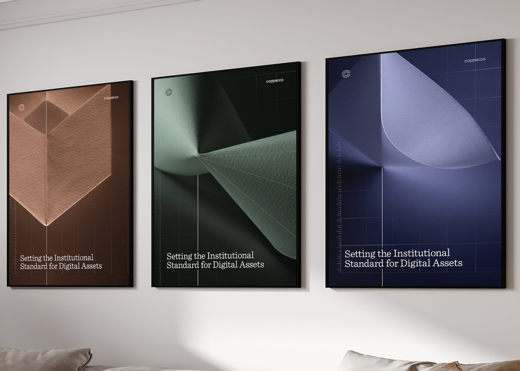
A series of A4 spreads with a range of origami cover pages.

a brand refresh conceptualised and executed within a month, delivered by a small in-house team

Arrow icon pointing to the right.

role:
design lead, art director

A series of posters showing origami

Brief:

Copper is a crypto custodian that builds the underlying digital infrastructure supporting the future of finance.

Owing to significant growth from a relatively unknown FinTech startup to a serious institutional player, Copper required a substantial brand refresh. Bar the logo itself, the entire visual architecture needed a maturity, centered around a new endline “Setting the Institutional Standard for Digital Assets”.

Concept:

Origami, paired with digital flourishes created the perfect visual metaphor of the old (Traditional Finance) and the new (Decentralised Finance). 

Origami, by nature, is mathematical and precise, as is the objective nature of numerics. Juxtaposed with 3D imagery, this traditional art was pulled into the 21st Century, reflecting the emerging technology of digital asset infrastructure — Copper’s core offering.
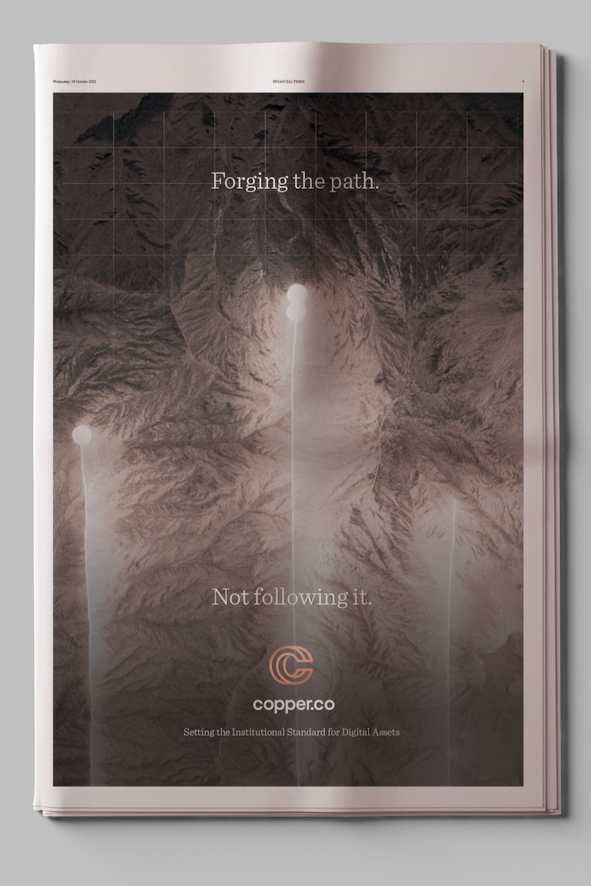
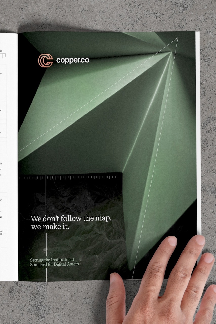
Targeting banks and institutions, the updated identity contradicts typical consumer focused crypto branding.

A newspaper ad that shows origami.

Origami is a nod to the past, therefore, not neglecting traditional finance. Its precise, sophisticated and mathematical nature serves as a great visual metaphor. The complimentary digital flourishes foreshadow blockchain’s influence in the finance space.

A hand holding open a magazine page that shows origami.
Three cover pages showing origami photography.