

Emirates embarked on a mission to infuse their award-winning ice in-flight entertainment system with a refined creative strategy and updated visual identity.
Renowned for its extensive and tailored content offering, ice has set the bar high in the industry. The objective of this brand refresh was to further elevate this unique experience, ensuring that the updated branding accurately mirrored its acclaimed status.
The creative strategy process involved an extensive discovery phase with Emirates. This encompassed exploring the broader entertainment and streaming landscape, identifying trends and defining the unique offering of ice. Throughout this process three key brand pillars emerged that formed the basis of the project: generosity, curation, and expertise.
Going deeper into the discovery phase, a key idea emerged: the concept of “a million to one”.
What happens in the moment before you press play? A million choices lead to one perfect moment. From a universe of choices, ice curates something just for you.

The ident for ice visually embodies the “million to one” concept, representing millions of forms of content, converging into a single point. Symbolising the moment before pressing play, it’s filled with anticipation, curiosity, and excitement.
Corey and his colleagues at Spafax art directed this sequence, leading x-particle artists for technical simulations and sound designers, whilst he individually conceptualised and animated the final logo resolve. Throughout this process, visual treatments were refined through Corey leading client discussion.

The tittle (the dot in the letter ‘i’) became a visual motif, symbolising the moment of experience. The motion surrounding this device also mirrors the three ice brand pillars: generosity, curation, and expertise. The tittle was paired with an intentional use of a horizon line to reflect the playback experience on the IFE system.
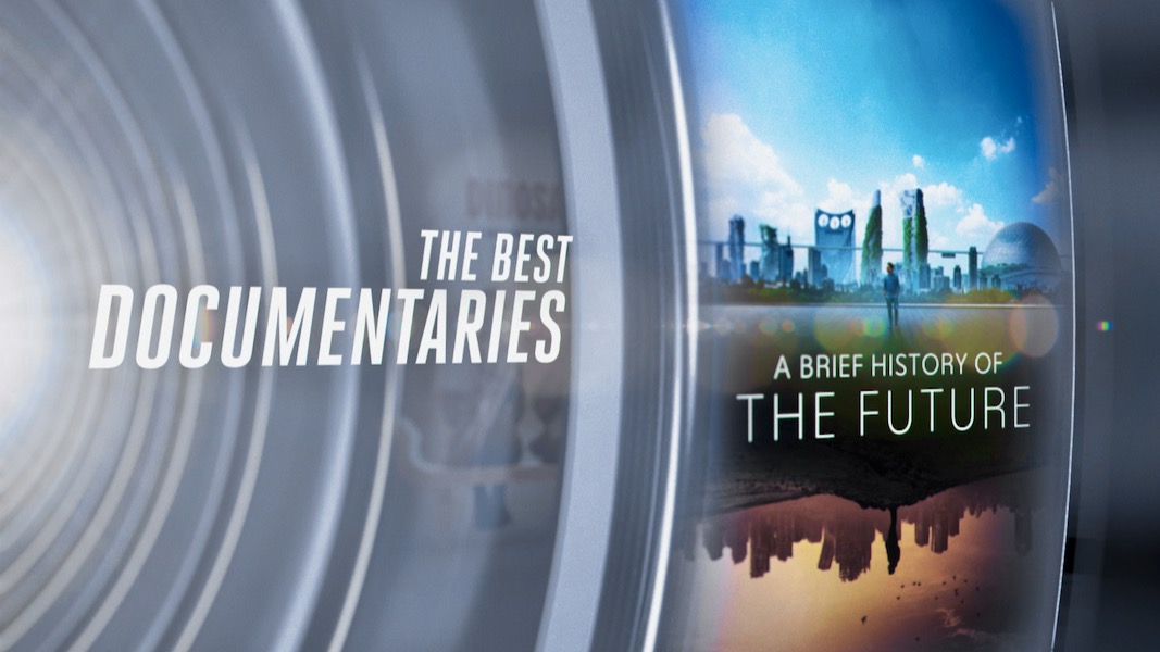
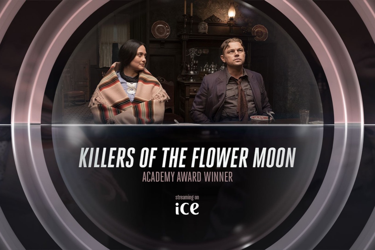
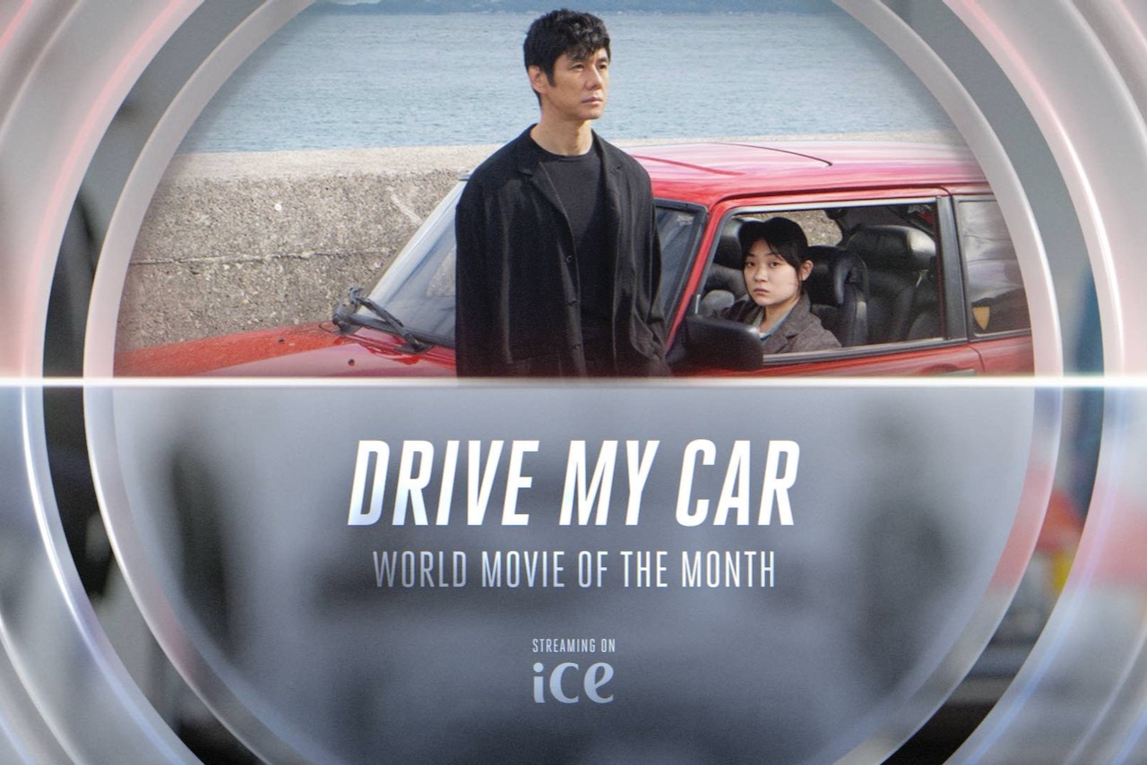
Corey led the entire design and motion execution for the channel identity, including the exploration of a variety of creative concepts and collaborating with the Spafax editing team. As promotional videos were produced monthly, each with unique themes, Corey created a series of motion templates including: titles, interstitials, captions, instructional videos, and welcome screens. These were adaptable to be paired with film or tv footage, stock footage, or static key art.
The updated visual identity was adaptable and seamlessly incorporated into various video promotions, including Emirates RED – the on-board retail experience.
Corey designed a 3D template that could seamlessly promote both the onboard magazine and products available to purchase throughout the flight. This template could easily be updated monthly and ensured a consistent art direction could be applied to various photography types and magazine spreads.
Additionally, the brand refresh was adapted into the monthly ice printed seatback magazine.