


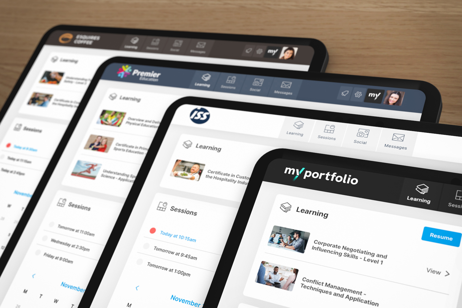

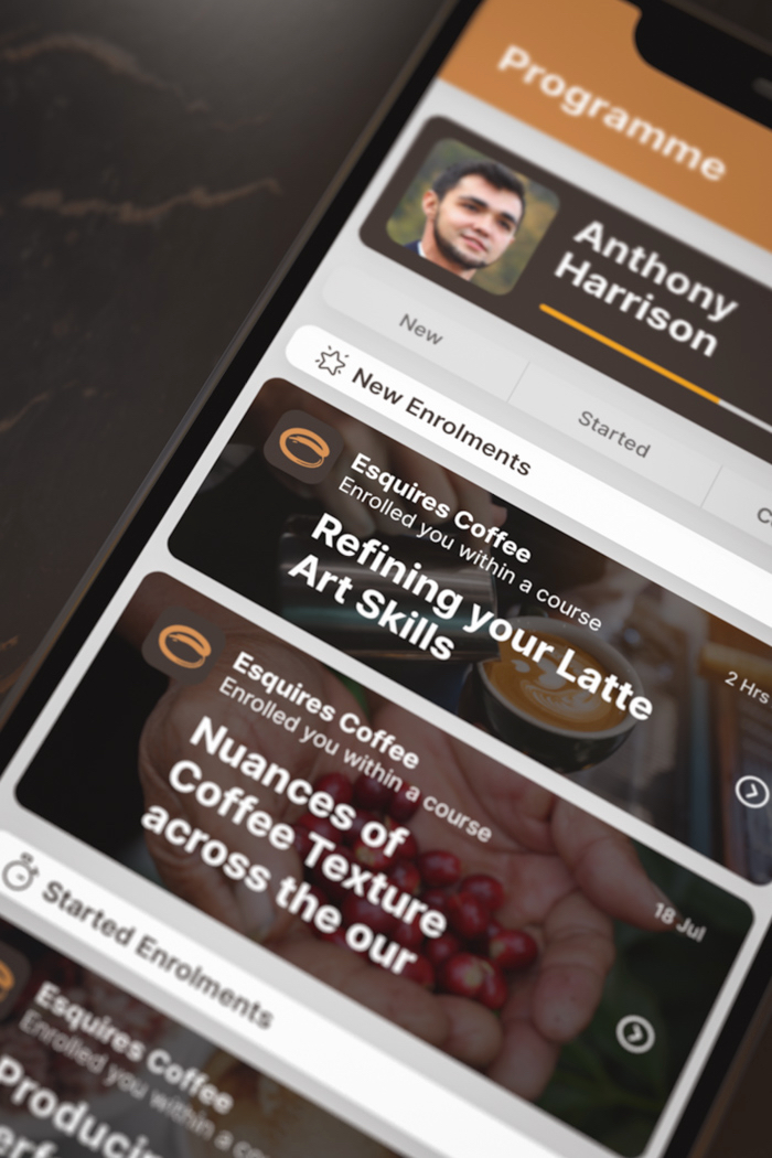
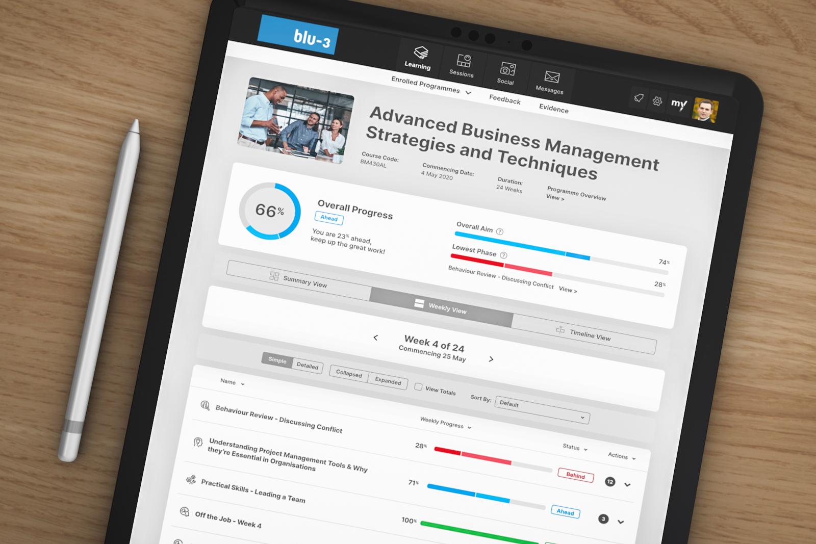
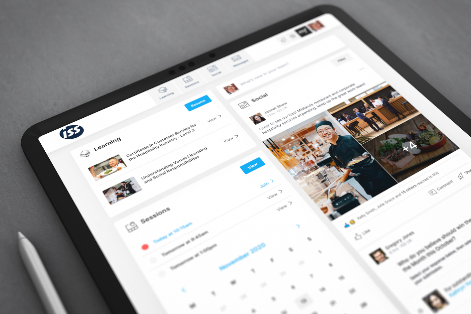
myPortfolio is a tailored apprenticeship platform hosting a variety of content and social tools, as part of the broader Olive product family for recruitment and upskilling.
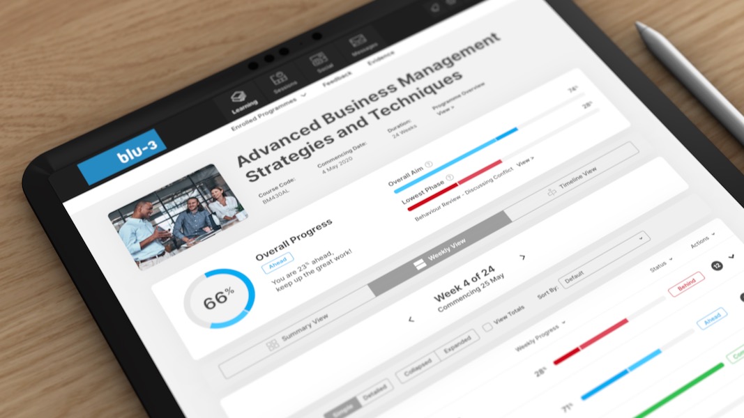
This platform allows learners to undertake various qualifications – each with a unique duration and assessment weighting. Social communication tools are also integrated into this system to encourage a collaborative experience.
Furthermore, powerful reporting functionality is available for the employers and assessors to encourage the learner’s journey, often over two years.
With the growth of the product through increased functionality and traffic, serious consideration around user experience needed to match progression.
Corey and the design team at Olive Group undertook an extensive review of the current product – with feedback from learners, assessors and employers. Highlighted throughout this process were a range of difficult and complex user journeys – instances where the features outweighed the flow. Two key user types were identified within the platform as part of this review:
Learners:
An aim was identified to ensure that learners were not intimidated or overwhelmed by the qualification process – as this was vital to ensuring their success.
For this to be achieved, a complete user interface overhaul was undertaken. This process stripped back complex information and used design principles to ensure progress could easily be communicated.
The revised user interface ultimately balanced the complexities of this powerful product, against an approachable, straightforward user journey.
Assessors:
The assessment process on a large education platform typically presents itself as a time consuming task for assessors, with large amounts of information needing to be processed.
To present a manageable approach of marking a variety of qualification types, the ‘Assessor Inbox’ was conceptualised. Using a similar design language to an email inbox, the assessor can clearly identify learners awaiting assessment or reassessment on submitted material.
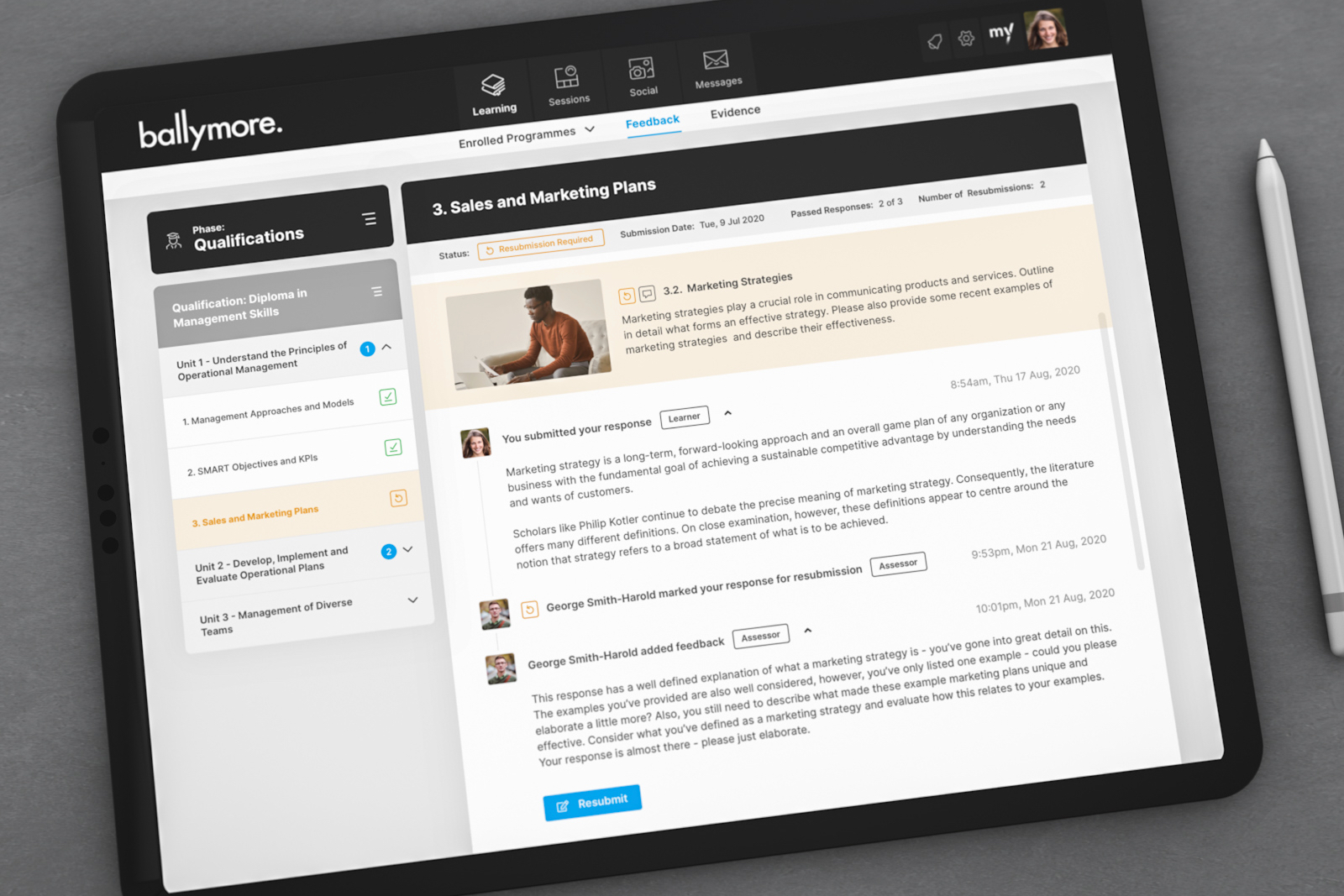
Understanding that two-way communication between the assessor and learner is vital to the qualification success, conversational tools were also implemented into this ‘Assessor Inbox.’
Not only did this interaction portal allow for encouragement toward the learner, it also ensured the assessors met their funding obligations toward the educational awarding bodies.